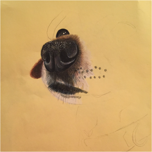
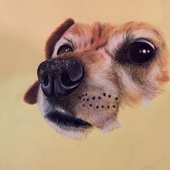
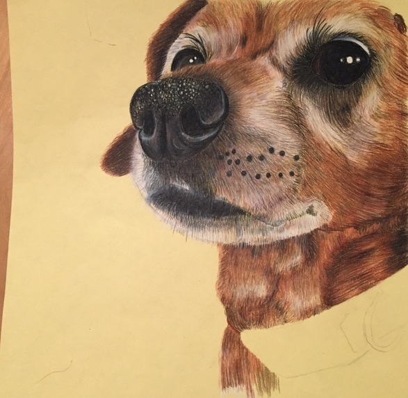

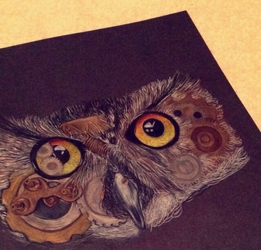
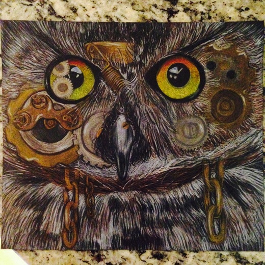
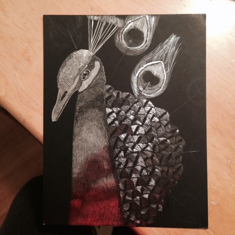
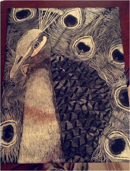
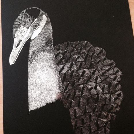
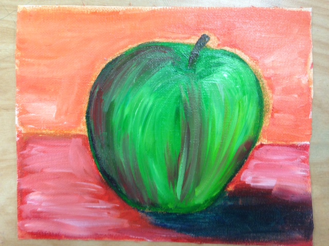
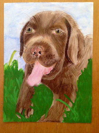
For one of our projects we had to do portraits of our pets. I liked this project because I was able to do art that had a meaning to me. It was difficult to know where to start laying down the texture. This piece had a variety of textures. I started my dog doing her nose first. I knew that would be an area that would be good to get done with first and I was also unsure about how to start the fur. I paid a lot of attention to the texture along with the highlights on the top of her nose. I noticed that it seemed to look like small circles with the highlight at the top. The nose definitely took some time but I was satisfied with how it turned out. I then went to the fur. The fur was challenging as well because I wanted it to look like fur but I also wanted it to be dark enough so that you couldn't see much of the paper behind it. It took a while as well, especially the face because of her gray spots. For the gray parts, I would just layer the paper in white prisma and then with a light gray or brown, draw lines over that area. The mouth and chin were probably two of the most challenging places on her face but I like how they turned out. Her body was difficult as well. I still make go back in and try to make the fur not look as unified. The collar wasn't too difficult either. I may still go back in and give some more highlights to the black plastic and give some shadow to the red cloth.
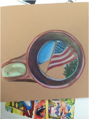
I am very satisfied with how this piece turned out. I feel like this picture captures her personality well. I may go back in and change some things but overall I'm done!
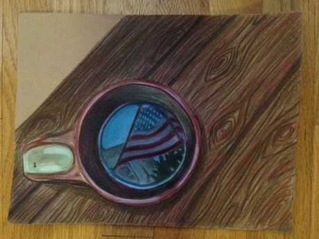
I am very satisfied with how this piece turned out. I feel like this picture captures her personality well. I may go back in and change some things but overall I'm done!
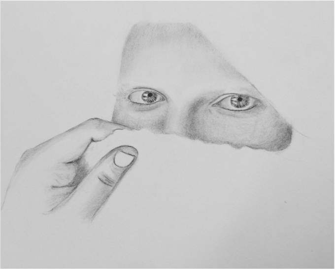
 RSS Feed
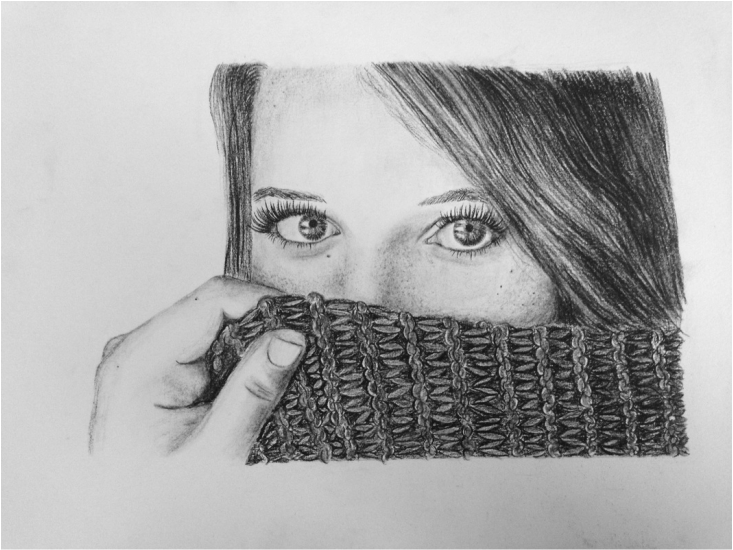
